How to Read Iran’s Industries with Hormuz
An industry can be visible in the stock market without being well understood in the real economy.
Market capitalization may show where listed value is concentrated, but not where production takes place. Heavy trading may signal rising attention, but not whether anything fundamental has changed. A map of companies may reveal geographic concentration, yet say little about liquidity, valuation or investor behaviour.
The Hormuz Industries workspace brings these layers together through two complementary views:
Industry Pulse shows how Iran’s listed industries are being valued, traded and followed by domestic investors.
Industry Map shows where those industries operate and how they connect to companies, infrastructure, product chains and Market Cases.
One reads the industry through the capital market. The other reads it through the operating economy.
The purpose is not to treat market activity as proof of industrial strength. It is to move from signal to structure, and from structure to a clearer decision.
Choosing the right view
Use Industry Pulse when the question concerns the listed market:
- Which industries hold the greatest listed value?
- Where is liquidity concentrated?
- Which groups are trading above their normal level?
- Where are individual investors buying or selling?
- Is an industry large but relatively inactive?
- Is current attention unusual only in the short term, or also against a longer history?
Use Industry Map when the question concerns operating reality:
- Where is the industry concentrated?
- Which companies are connected to it?
- What infrastructure supports it?
- Which provinces and product chains matter?
- Are there specific Market Cases that show how the industry works in practice?
The two views answer different questions. A strong market signal does not automatically imply a strong industry thesis, and a strategically important industry may have limited representation on the exchange.
Industry Pulse: reading the listed side of an industry
Industry Pulse organises the latest synchronized market data into industry groups.
It brings together listed market value, daily trading, activity against recent norms and net individual-investor flow. Values can be viewed in IRR or USD, using the same shared Hormuz Market Data Hub rate applied across the platform.
The Pulse is best read as a view of the listed portion of an industry. It does not measure the full size, output or productive capacity of that industry.
Listed market value
Listed market value is the combined capitalization of the companies included in each covered group.
It shows where visible public-equity value is concentrated and which industries have the greatest weight in Iran’s listed market.
This is useful for comparing sector scale, understanding which groups influence the broader index and identifying industries with meaningful public representation.
It should not be confused with total industry size. Private companies, state-controlled assets, informal activity and unlisted operators may represent a large part of the real economy without appearing in the figure.
The correct reading is therefore:
How large is this industry inside the listed market?
Not:
How large is this industry inside Iran’s economy?
Daily trade value
Daily trade value shows how much equity changed hands within each industry during the latest session.
Its main value is in measuring participation and liquidity.
A large industry with little daily trading may have substantial headline value but limited practical depth. A smaller industry with heavy trading may be undergoing active repricing or unusual investor attention.
Daily trade value does not represent new investment in productive capacity. It reflects transactions between market participants.
Net individual flow
Net individual flow measures purchases by Iranian individual-investor accounts after subtracting their sales.
It shows where domestic individuals were net buyers or sellers during the session.
The figure becomes more useful when read beside price performance and trading activity.
An industry may rise while individual investors are selling. Another may decline while attracting net buying. These differences can reveal whether price momentum and investor positioning are moving together or diverging.
The signal is not foreign capital flow and does not predict the next price move. It is a measure of domestic positioning.
Activity against the 30-day norm
Industry Pulse compares the latest trading value of each group with its own 30-day average.
The headline count shows how many industries are trading at or above that recent norm.
This helps distinguish a broadly active market from one in which attention is concentrated in only a few groups.
If many industries are trading above normal, participation is relatively widespread. If only a small number are active, the session may be driven by a specific event, theme or speculative rotation.
Four ways to explore the Pulse
Industry Pulse offers several views because market size, liquidity and attention are not the same thing.
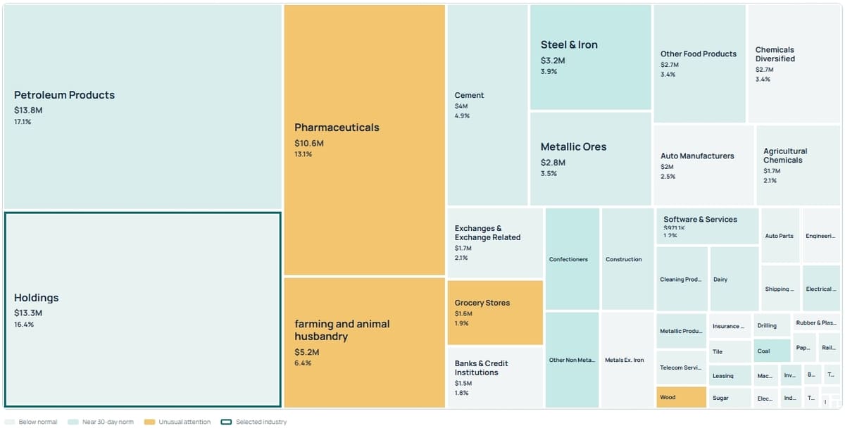
Market Footprint
Market Footprint shows where listed value is concentrated.
Larger tiles represent industries with greater listed market capitalization. Their visual treatment indicates whether trading is below, near or above the recent norm.
This view is useful for understanding the structure of the listed market at a glance.
It can reveal the difference between:
- a large and active industry;
- a large but quiet industry;
- a small group receiving unusual attention.
The insight comes from reading size and activity together.
Trading Activity
Trading Activity reorganises the view around daily traded value rather than market capitalization.
Industries receiving more trading become more prominent, even if their total listed value is relatively small.
This view helps identify:
- where liquidity was concentrated;
- which groups dominated the session;
- where sector rotation may be taking place;
- which smaller industries are attracting significant participation.
High trading activity is not necessarily positive. Heavy turnover can occur during both accumulation and selling pressure.
Unusual Attention
Unusual Attention compares the latest session with each industry’s own recent baseline.
A reading of 1.0× means activity is close to its 30-day average. A reading of 1.5× means trading is roughly 50% above normal. A figure below 1.0× indicates quieter-than-usual activity.
This view is designed to answer:
Where is something changing?
It can surface smaller industries that would otherwise remain hidden inside a market-capitalization view.
Unusual attention is an invitation to investigate, not a conclusion. It does not explain whether the cause is earnings, policy, commodity prices, currency expectations or temporary speculation.
All Industries
Treemaps are effective for showing concentration, but small industries can become difficult to inspect.
The All Industries view presents the covered groups in a readable list, making it easier to compare market value, trading activity and recent performance directly.
It is the better view for systematic research or for examining industries that occupy only a small part of the treemap.
Reading an individual industry
Selecting an industry opens a more focused panel.
Depending on the available data, it may show:
- listed market value;
- daily trade value;
- daily turnover;
- activity versus the 30-day norm;
- activity versus the 200-day norm;
- a connection to the corresponding Hormuz industry profile.
Daily turnover relates traded value to market capitalization. It provides a rough indication of how actively the industry’s listed value changes hands.
The 30-day comparison shows whether attention has changed recently.
The 200-day comparison adds a longer baseline. An industry can look active against the previous month while remaining ordinary against its longer history. Reading both periods helps distinguish a temporary change from a genuinely exceptional event.
Where the listed group is mapped to the Hormuz taxonomy, the panel provides a direct route into the wider industry profile. This is where the market signal can be tested against operating context.
Industry Map: seeing where the industry operates
Industry Map approaches the question from the opposite direction.
Instead of beginning with price or liquidity, it begins with geography and operating relationships.
The map connects:
- industries;
- product chains;
- provinces;
- companies;
- infrastructure;
- Market Cases.
This allows users to move beyond the national industry label and inspect where activity is actually concentrated.
Filtering the operating landscape
The map can be filtered by industry, product chain and province.
These filters can be used separately or combined.
A user might begin with a broad industry, narrow it to a specific product chain and then focus on one province. The resulting view shows the companies, infrastructure and cases connected to that combination.
This can reveal:
- regional industrial clusters;
- concentration of operators;
- dependence on particular infrastructure;
- the relationship between production and logistics;
- gaps in the currently indexed value chain.
A national industry can contain very different regional realities. Production, processing, transport and demand may be spread across separate provinces. The map helps make those differences visible.
Search and Current Intelligence View
The workspace also supports direct search across companies, Market Cases, cities and infrastructure.
This is useful when the user already knows an entity and wants to understand the surrounding context.
Rather than opening a company as an isolated profile, the map can show the province, infrastructure, product chains and cases connected to it.
The Current Intelligence View summarises the active selection and shows the number of matched entities and mapped locations.
These figures describe Hormuz’s current coverage. They should not be read as a complete census of every Iranian company or asset.
The three map layers
The map separates Companies, Infrastructure and Market Cases so that each can be inspected independently.
Companies
Company markers represent indexed producers, operators, suppliers, service providers and other commercial participants.
This layer can help users:
- identify potential counterparties;
- locate operating clusters;
- find producers and suppliers;
- understand where visible commercial capacity is concentrated;
- continue into individual company profiles.
A marker confirms a connection inside the Hormuz graph. It does not by itself verify current capacity, product quality or counterparty reliability.
Infrastructure
Infrastructure markers show the physical systems that support or constrain the industry.
These may include ports, railways, industrial zones, energy assets, logistics facilities and processing infrastructure.
This layer can explain why an industry is concentrated in a particular place. It can also reveal dependence on a limited number of assets or corridors.
Infrastructure should therefore be read in two ways:
- as an enabler of industrial activity;
- as a potential source of concentration risk.
Market Cases
Market Cases provide a more concrete commercial layer.
They connect an anchor—such as a province, city, company or infrastructure asset—to an industry, market, product chain or challenge.
Their purpose is to move the user from a broad question such as:
Where does this industry exist?
to a more practical one:
What commercial or investment situation can be examined here?
Market Cases can add context around demand, market access, execution conditions and operating risk.
Connected product chains
The sidebar shows the product chains connected to the current view.
This is important because broad industry categories often contain several very different economic systems.
Mining and Metals may include iron ore, steel, copper, aluminium and cement.
Energy may include crude oil, refined petroleum products, gas, petrochemicals and electricity.
Agriculture and Food may span production, processing, packaging, cold storage and consumer distribution.
The product-chain layer helps reveal:
- which products dominate an industry or province;
- whether activity is concentrated upstream or downstream;
- which companies and infrastructure connect the chain;
- where potential gaps may exist.
It turns a broad industry label into a more precise operating question.
Reading locations correctly
Not every indexed entity has a precise public coordinate.
Hormuz therefore uses the best available geographic relationship, which may come from a company, city, infrastructure asset or broader province assignment.
The legend distinguishes these location types.
A province fallback should be interpreted as an association with that province, not as the exact location of a factory, office or asset.
The map aims to preserve useful coverage without creating false precision.
Using both views together
The strongest use of the Industries workspace comes from moving between the Pulse and the Map.
Suppose an industry appears among the unusual-attention leaders.
A disciplined reading would be:
- Open the industry detail.
- Compare market value with daily trade value.
- Review activity against both the 30-day and 200-day norms.
- Check whether individual investors were net buyers or sellers.
- Open the connected Hormuz industry profile.
- Move to Industry Map.
- Inspect companies, infrastructure and product chains.
- Review relevant Market Cases.
- Identify possible explanations for the market signal.
- Define what still requires verification.
This sequence separates three questions that are often confused:
- What is the listed market doing?
- What exists in the operating economy?
- What does either of them mean for a real decision?
Who can use the workspace?
An investor can use Industry Pulse to compare listed scale, liquidity, attention and domestic positioning, then use Industry Map to test whether the industry has visible operating depth.
A market entrant can begin with the Map to identify regions, companies, infrastructure and product chains, then use the Pulse to understand how the listed part of the industry is currently being valued and traded.
A supplier or buyer can use the map to narrow potential counterparties and understand geographic or logistical dependencies before moving into deeper verification.
An analyst can use unusual attention as an early signal and then test it against operating structure, connected cases and longer-term activity.
In each case, the workspace narrows the research question. It does not replace due diligence.
Why the English and USD layers matter
Iranian industrial information is usually fragmented across Persian-language market systems, company records, regional reports and separate geographic sources.
Hormuz brings the market and operating layers into one English-language workflow and applies a consistent USD reference to current listed-market values.
A careful positioning statement is:
To our knowledge, Hormuz is the first public English-language platform to combine current Iranian listed-industry capital, liquidity and attention signals, synchronized USD values, and a connected map of companies, infrastructure, product chains and Market Cases in one workspace.
The claim concerns the combination of these layers, not the existence of every individual dataset.
What the workspace does not claim
Industry Pulse does not measure the full economic size or productive strength of an industry.
Industry Map does not contain every company, asset or exact coordinate.
High trading activity does not prove strong fundamentals.
Unusual attention does not predict future returns.
Infrastructure proximity does not guarantee access or available capacity.
A mapped company is not automatically a verified counterparty.
These limitations matter because the purpose of the workspace is not to create false certainty. It is to organise the evidence clearly enough that the next question becomes easier to identify.
From signal to structure
Industry Pulse shows where listed value, liquidity and attention are moving.
Industry Map shows what sits behind the industry: companies, locations, infrastructure, product chains and commercial cases.
One can identify where to look. The other can help explain what exists there.
That is the central logic of the Hormuz Industries workspace:
Read the market signal, inspect the operating structure, and only then decide what the industry may mean.